S3.2: Descriptive Statistics

Course Organisation

During today’s session, I will mostly work through some example descriptive statistics with you. The resources for revising the concepts are listed in this post.

Starter

We will discuss the Usability Assignment on LEARN.

Resources

I strongly recommend this online textbook: Online Statistics Education, an Interactive Multimedia Course of Study

The relevant sections for you are the Introduction (Sections 1-11), Summarising Distributions, Graphing Distributions, and Research Design. These are the basic skills you should have for reporting your data.


S3.1: Usability Assessment

Course Organisation

  • Please all sign up for tutorials via LEARN. We use tutorials to check attendance, which is particularly important for students on Tier 4 visas.
  • If you miss Questions and Comments, you can’t make up for them. They are a very small part of the final grade, though.
  • The Assignment for the Usability Study will be released tomorrow.
  • Questions about my MSc projects? I have two information sessions on Friday, February 1, 2-3 and 3-4, Room 4.31/4.33 Informatics Forum, or you can ask me after the lecture. You must complete the Google Form for me to rate you suitable.

Starter

Compare the landing pages of four big search engines:

What are the main differences?

Themes from Questions and Comments

Which Technique to Use When?

As with all research, this depends on

  • how much time you have to design and run a study
  • what access you have to end users
  • what equipment you have
  • what you want to find out

Whether a study in the lab is valid depends on how much findings will be affected by context. For example, if you want to use eye tracking to find out what draws attention, and what users read first, you can do that in the lab.

More on A/B testing

A/B testing is useful if you have an alternative (B) to your existing design (A) that you wish to test, if you have a substantial user base already, so that you can get enough data, and if you have put enough work into B to be able to deploy it. It is for solutions that are either easy to implement, or that have been pre-tested sufficiently. Lab studies are useful for pre-testing.

Field experiments are often neglected, because they are difficult to do, but these can tell you the most about how your system is actually used in practice. Methods from ethnography are useful here.

Heuristic Evaluation – What and Why?

You use guidelines and design patterns to create your technology, and you can use heuristic evaluation to check what you have created. Here are some more practical examples of the classic Nielsen guidelines: 10 usability heuristics with examples.

Heuristics also need to be weighed against each other – there is a good reason why Naver is less minimalist than Google!

Face Validity

Many questionnaires don’t measure what they are intended to measure or what they appear to measure. Face validity is all about appearance. Does it look like a questionnaire is measuring usability (face validity), or does it actually measure usability (construct validity)? We care about construct  validity. I often recommend the System Usability Scale to my students for measuring user satisfaction – this link to the paper should work. Although the SUS was designed to be quick and dirty, it has turned out to have good reliability and good construct validity, and it has been used over so many studies that values are now well calibrated.

S2.2: Cognition (2019)

Course Organisation

  • Don’t worry if you missed the Questions and Comments from Week 2. You will still be able to do well on the assignment.
  • We have tutorials! You can sign up on LEARN – the link to Tutorial Groups is on the left hand side, below “Announcements”. There are 8 groups at the moment. We start next week.

Starter

When Microsoft switched from Windows 7 to Windows 8, the new user interface was a shock, because it ditched most existing mental models of what the Windows operating system should look like.

This article is a good summary of the main critiques when Windows 8 first came out. (Also: Anyone remember netbooks?)

This article is a good reminder of why usability doesn’t predict sales. (Also remember: what Steve Jobs and Apple did was to make actual user needs, which can be quite different from what users think they need, part of their design process.)

Themes from Questions and Comments

Theme 1: Clarifying the different types of memory

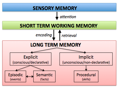
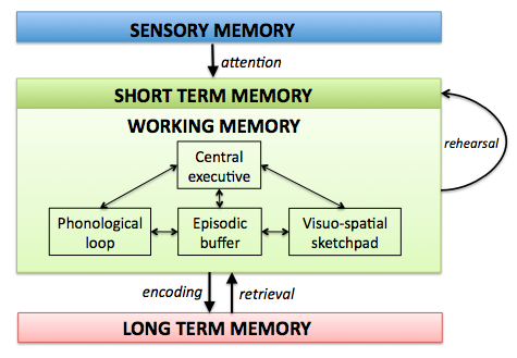
What I am teaching you here is one particular type of theory, based on the approach of Alan Baddeley and colleagues, which is well studied and has a lot of evidence. The graphics below are based on this theory.

Long term memory versus sensory and short term memory
Relationship between short term, sensory, and working memory
Working memory in the context of different types of memory
How the detailed structure of working memory fits into the picture

Theme 2: Can we avoid user bias?

No – we have to work with them and around them. One of the main points of understanding how perception works is that this knowledge allows you to exploit perceptual biases to structure user interfaces and guide the user’s attention. Perception and cognition are closely linked, for good reason.

Theme 3: Can mental models be changed and adapted?

Yes, they can – but you need to make sure it’s worth the effort

Theme 4: Recall versus recognition

if we want to build interfaces for people who use systems rarely, if we want to add in a layer of redundancy, if we want to help people who have forgotten the commands, we make sure people can recognise what to do.

If we want to make interfaces fast to operate, we support fast recall.


S2.1: Perception (2019)

Course Organisation

  • We now have around 102 people enrolled in the course. I expect ITO to arrange and release tutorial slots soon.
  • The blogs provide a scaffold of what is discussed in class.
  • Questions and Comments are closed for submissions on Monday 9am on the week when the material is discussed, to give me enough time to prepare the lectures based on your feedback.

The News

High pitched sounds repel teens

But is it really needed? (Read the comments!)

From Questions and Comments

What are realistic perceptual thresholds for design?

Realistic thresholds allow people to perceive signals in realistic contexts. This is why questionnaires ask people to report how well they can do in typical situations where they will use a certain sense. For example, for vision, one would ask how well a person can read newspaper headlines, or for hearing, whether they can hear birds chirping in the trees.

For hearing, think about background noise. The signal needs to be louder than the noise (signal to noise ratio).

Example from radio 

Thresholds, for example for people’s ability to understand speech, are calibrated first using standardised tests in quiet, and then tested again with background noise.

Thresholds vary from person to person – they are affected by age, acute illness, chronic illness …

In order to decide on the correct thresholds for design, we need to understand

  • who is using our systems
  • under what circumstances

What is Signal Detection Theory, and why does it matter?

Here is an alternative introduction by David Hager.

Link to Machine Learning: The Receiver Operating Characteristic is related to Signal Detection Theory

What are affordances, and why should we care?

Physical affordances are what you can do with a physical object – properties of the object that you can act on. For example, pick it up, wave your hands in front of it, move your hands under it, move the handle …

Example: Washroom water taps. This one by Dyson is particularly badly designed, because it is very easy to dry your hands when you just want water.

Perceived affordances are about what users think they  can do  with an interface.

Conventions is what designers use to communicate with users, to signal to them that something could be of interest / can be interacted with

Example: Where are buttons and links that you can click on a web site? How do you notice? When this is not clear, we have a case of Mystery Meat Navigation

Many of the examples on the Bad Designs web site are bad because of the affordances.

Affordances can also be ignored: See the “Desirepath” subreddit, where people subvert designed paths to make their own